Monday, 17 March 2014

fairy tale drawings


Here are five drawings I've done of evil figures, that are used in fairy tales. I drew them first in pencil then I went over them with black pen ink. I found these images from the internet and drew them by trying to draw them accurately and detailed. I like the drawings because I believe the detail of the original images has transferred onto my drawings well in most sections, but next time I need to draw some of the overall shapes and some of the detail on my drawings more accurately. I need to now put them on Photoshop and add colour to them, to see how they work with the colours from the original images.  

I feel these drawings have allowed me to explore ways of working with different fairy tale themes, like fairy tales with animals involved.

These drawings link with my snap card projected, where I drew the football club badges from the internet and tried to drew them as accurate as I could, but I feel some of the detail from these drawings are drawn more accurate than some sections of the club badge drawings.   

Tuesday, 11 February 2014

UEFA clubs cup playing cards


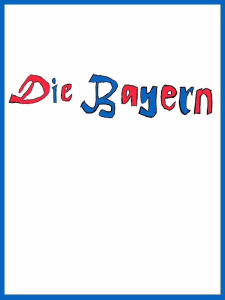
Here are the snap card series I created based around my drawings and the different styles of front I wrote out. I wanted to create a snap card series, where their would be drawings of different clubs that have been in at least one European final, where in the series they would be matched with their nicknames in the game of snap.

 With the drawings and text I put them on Photoshop and using the levels tool I made the outlines of the drawing and text stronger, so they would become more clear, than using images of the original badges from the internet I transferred the colours from the original badge onto the drawn badge and styles of text, using the colour filter I also created an coloured outline on the card based again around the colours on the badges.

 I like the cards because I believe the colours added to the badges make them look more realistic and makes the pieces of texts and the club badges that are paired together work well together, where the colours are similar, but next time I need to draw different sections on the club badges more accurately and better positioned.


nicknames of clubs in different styles of front


Here are all the nicknames from all the clubs that I drew in the last post, where I have explored different types of front. With the text I wanted to have different types of text for each nickname, so they would all be different and I also wanted some of they, mostly clubs from the some country fronts to be similar to each other too. I like the styles of text because the written style, which I drew the letters from are very accurate and the letters in each word all fit in well with each other, but next time I need to make the outlines of the letter bolder, stronger, so there more clear.